
1910 is remembered for a number of major historical moments. In Portugal, it was the year of the establishment of the Portuguese Republic and the subsequent change to national symbols - the flag, the coat of arms and the national anthem.
In Italy, 1910 delivered another event of huge significance - at least for us petrolheads.
That was the year Anonima Lombarda Fabbrica Automobili (A.L.F.A.) was founded in Milan, Italy. Only later, in 1920, would A.L.F.A. be renamed Alfa Romeo, a reference to Nicola Romeo, who took over the company’s leadership in 1915, during the First World War.
The connection to Milan
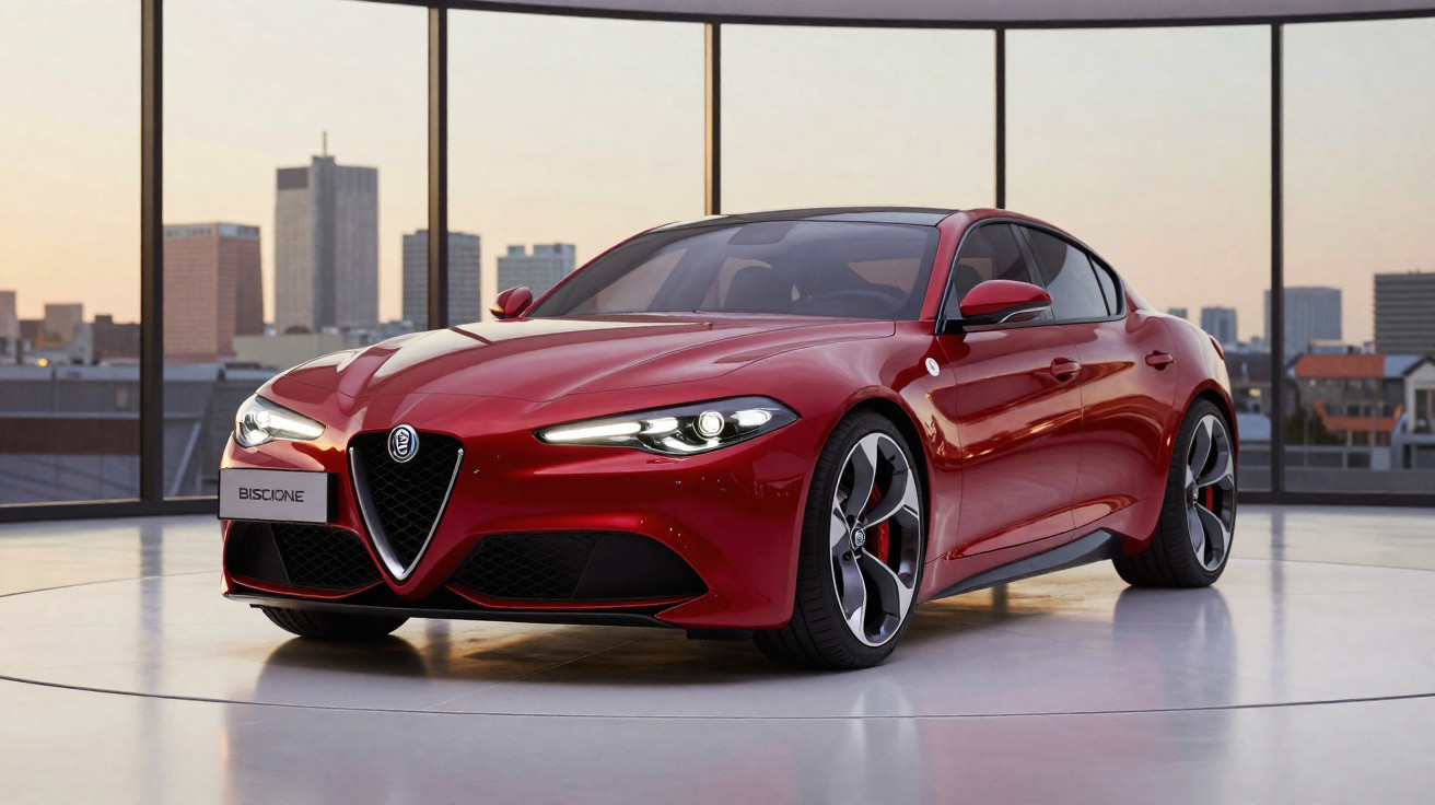
Right from the outset, A.L.F.A.’s first badge set down the elements we still associate with it today. The suggestion to include the Biscione - the serpent emblem linked to the Visconti family, who ruled Milan in the medieval period - came from Romano Cattaneo, a close friend of A.L.F.A. engineer Giuseppe Merosi: “It was love at first sight”.
Even so, it still did not feel complete. Something was missing. Several attempts were needed before a final solution emerged, but once it did, the first emblem of the Italian marque was, above all else, a tribute to the city where it was born: Milan.
The Biscione ended up paired on its left with the cross of Saint George - Milan’s flag and coat of arms - on a white background. Encircling both symbols was a blue ring, representing the Royal Family, with the inscription “ALFA” at the top and “Milano” at the bottom.
Is the Biscione swallowing a person?
The Biscione remains a subject of debate to this day. Is it truly swallowing a person - and where did it come from? Historians still do not agree on its precise origins or meaning. What is clear is that it has been associated with the Visconti family and the city of Milan since the Middle Ages, dating back to the era of the Crusades.
Some argue the serpent is devouring a person (either symbolising Saracens defeated during the Crusades, or even an innocent child), as a depiction of the snake’s power and dominance over its prey. Others believe the serpent is “giving birth” to a person, representing renewal and transformation within the cycle of life.
Whatever the interpretation, Alfa Romeo has never dropped the Biscione from its identity - yet this emblem, along with the wider logo, has continually evolved right up to the present day.
It has changed eight times
Between 1910 and 2015, the logo was revised eight times, without ever abandoning its two defining elements.
The first change arrived in 1920, when A.L.F.A became Alfa Romeo. The word “Romeo” was added to the “ALFA” inscription.
In 1925, following victory in the very first world motor racing championship, Alfa Romeo added a laurel wreath around the familiar badge.
After the Second World War (1945), the symbol was completely reworked in red with gold lettering, effectively removing references to the Royal Family and the monarchy: the blue ring and the Savoy knots that had separated the words “Alfa Romeo” and “Milano”.
This reflected Italy’s own turning point, as the country moved from a monarchy to a republic. It did not last long: in 1950, with the launch of the 1900, the logo’s original colours returned.
In 1972, another “major” shift took place. Alfa Romeo introduced the Alfasud, the first model to be built outside Milan, at a new factory near Naples. This change justified the removal of the word “Milano” from the emblem, and the hyphen between “Alfa” and “Romeo” also disappeared.
A further variation followed in 1982, using gold for the outline of the blue ring as well as for the lettering.
Alfa Romeo’s most recent logo update came in 2015, for its 105th anniversary, which also coincided with the unveiling of the Giulia.
The division between the cross of Saint George and the Biscione was removed, with both symbols sharing the same background, now in grey. Gold was eliminated and replaced by a new silver tone, while the ring’s blue became darker.




Comments
No comments yet. Be the first to comment!
Leave a Comment